Colour drift starts small. A designer shares a HEX value, a developer converts it to RGB, someone adjusts opacity, a second tool displays HSL, and a later token file contains something that looks close but is not quite the same. Nobody intended to change the palette, but the system now has several versions of one colour.
That is why colour conversion should be treated as a handoff step, not a casual copy-and-paste detail. The same colour can be expressed in different formats, but the conversion needs to be deliberate.
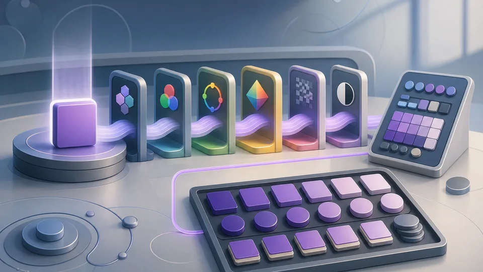
The Color Picker & Converter helps convert between HEX, RGB, RGBA, HSL, and HSV values, with quick black-or-white contrast cues. It works beside the Color Palette Generator when you need supporting swatches, and the WCAG Contrast Checker when foreground and background readability needs a more focused check.
Different formats serve different jobs
HEX is compact and common in CSS, design files, documentation, and quick sharing. RGB makes the red, green, and blue channels explicit. RGBA adds transparency. HSL can be easier when adjusting hue, saturation, or lightness. HSV is common in picker interfaces because it maps neatly to how many colour tools present choices.
None of these formats is automatically better for every job. The right format depends on the handoff. The important part is that the value is converted accurately and consistently.
HEX is convenient but not always expressive
HEX values are easy to paste and compare. They are also easy to misread. A tiny channel difference can create a subtly different colour. When opacity enters the picture, plain HEX may not communicate the full styling intent unless alpha is included or documented separately.
For design tokens, HEX can be a good final value, but teams still need a reliable way to convert from the format used in design tools or brand references.
RGB helps when channels matter
RGB values make channel changes visible. If a colour needs to be adjusted toward warmer, cooler, lighter, or darker values, seeing the channels can help. RGB is also useful when APIs, canvas tools, image scripts, or older snippets expect numeric channels.
When moving from RGB back to HEX, conversion mistakes are common enough to justify using a tool rather than mental arithmetic.
RGBA makes transparency explicit
Opacity can change the apparent colour depending on the background. A semi-transparent overlay on white is not visually the same as the same overlay on dark blue. RGBA is useful because it keeps the alpha value attached to the colour instruction.
For reusable tokens, be careful with alpha values. A transparent token may work in one component and fail in another if the background changes. Name the token according to its job, not just its appearance in one context.
HSL is useful for systematic adjustments
HSL separates hue, saturation, and lightness. That can make planned adjustments easier. If a hover state needs to be slightly darker, changing lightness may be more intuitive than editing RGB channels.
But HSL is not magic. Equal numeric changes do not always feel equal to the eye. Check the result visually, especially for brand colours and interface states.
HSV matches many picker workflows
HSV is often used in colour picker interfaces because it represents hue, saturation, and value in a way that suits selection panels. If a tool reports HSV, converting it cleanly to CSS-friendly formats avoids guesswork.
This is especially useful when documenting colour choices from a tool that does not use the same format as the implementation.
Contrast cues are a first check, not a full audit
A quick black-or-white contrast cue can help choose readable text over a swatch. It is a useful first signal when building palettes, badges, charts, labels, or buttons.
However, a colour converter is not a full accessibility audit. For actual foreground and background pairs, use a dedicated contrast checker. Consider text size, weight, state, disabled styling, focus indicators, and the surrounding interface.
Design tokens need stable colour decisions
Tokens are meant to reduce repetition and drift. That only works if the source values are agreed. If one token uses a converted value and another uses a near match from a design file, the system starts to fragment.
Before adding or changing tokens, convert values once, verify the result, and document which format is canonical. Some teams store HEX, some store RGB channels, and some store multiple derived values. The key is consistency.
Watch for named colours and browser defaults
Named colours can be convenient in examples, but production systems usually benefit from explicit values. Browser defaults, shorthand values, and copied snippets can introduce colours that do not belong to the design system.
When reviewing CSS, look for one-off values that should be tokens. A converter can help identify whether two values are actually the same colour in different formats or separate colours that merely look similar.
A practical conversion workflow
Start with the source value from the design file or brand reference. Convert it into the format needed for implementation. If opacity is part of the design, keep alpha visible. Check the colour on the likely background. If it becomes a reusable token, name it by purpose and record the canonical value.
Then check variants. Hover, active, border, muted, background, and emphasis colours should not be random neighbours. If they are derived from the same base colour, note how they were derived so the next change does not restart the guessing.
Document the source of truth
Colour systems become easier to maintain when everyone knows where the source of truth lives. It might be a design-token file, a design system package, a Figma library, or a documented brand palette. What matters is that updates flow from one place rather than from memory.
When a converted value is added to code, note whether it is canonical or derived. A hover colour, translucent overlay, or chart variant may be derived from a base token. If that relationship is invisible, later edits can turn a deliberate system into a set of unrelated close matches.
Check colours in their actual context
A swatch can look excellent in isolation and weak inside an interface. Background colour, surrounding contrast, spacing, text weight, borders, shadows, and state changes all affect the final result. Conversion accuracy is necessary, but it is not the same as visual approval.
After converting values, test them where they will be used. Buttons, badges, charts, form states, alerts, and navigation surfaces all put different pressure on colour. A good converter keeps the values consistent; the interface review decides whether those consistent values are doing the right job.
Keep one-off values visible during review
When a project has many near-identical colours, review becomes harder. Keep temporary one-off values visible until they are either promoted into tokens or removed. A converter helps confirm whether a value is genuinely new or just another format for an existing swatch.
This is especially helpful during redesigns, where old colours, new colours, and transitional states can sit together for a while.
What this should not claim
A colour picker and converter does not create a complete brand system, guarantee accessibility, extract palettes from images, simulate colour blindness, or replace design review. It converts entered values and gives quick comparison signals.
Use it to keep colour handoff clean. When HEX, RGB, RGBA, HSL, HSV, alpha, and token usage are checked in one place, palettes are less likely to drift one almost-matching value at a time.